Original website designs for distinctive therapy practices.
A site that looks, feels and sounds unmistakably like you.
These are design studies — some completed work, some imagined practices — created to show the range of what's possible when a therapy website is designed around a person, their work and the people it's designed to reach.
Each one begins with a different kind of practitioner and explores how their approach might shape the words, colours, typography, imagery and atmosphere of a site. They aren't templates to choose from. Your own website would begin with your practice.
Imagined practices and briefs — shown here to give a sense of how a site can look. Best seen on a desktop, where the details of designs come through.
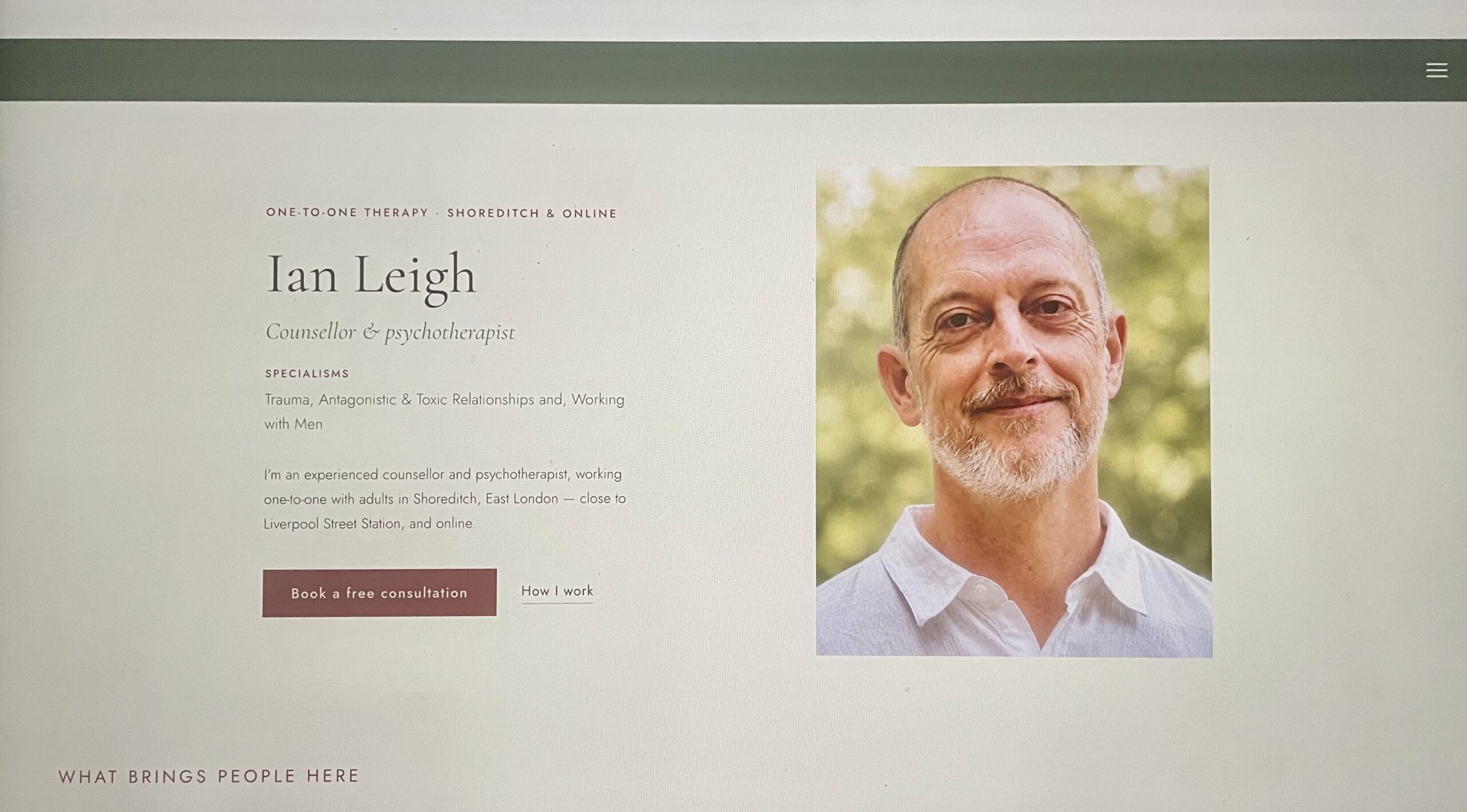
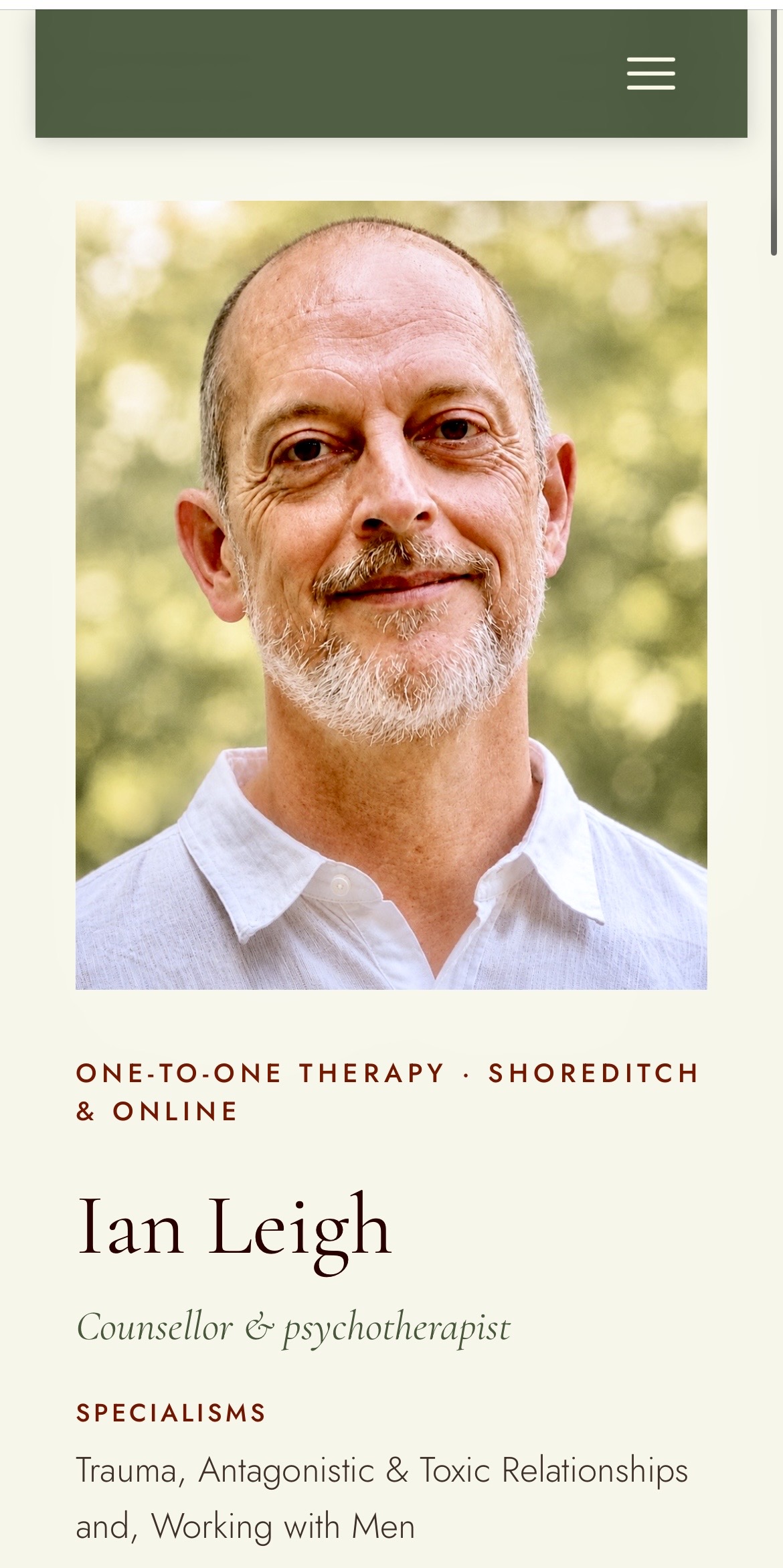
Holding weight and warmth
A trauma-informed psychotherapist working with complex trauma, toxic relationships and men's emotional lives.
The site needed to hold difficult material — trauma, toxic relationships, and emotional disconnection — without ever feeling clinical or cold. A pale paper ground with greens and reds as accents, generous spacing, and text that feels unhurried let the site feel steady rather than urgent. The Reflections section extends that same care into a library of writing, giving prospective clients a clear sense of how Ian thinks before they ever make contact.
A pale, paper-like ground keeps the site light and unhurried, while deeper accent tones carry the headings and calls to action — present without ever feeling urgent or clinical. That restraint gives difficult material somewhere steady to land, rather than crowding it. Generous space and an unhurried serif voice let the site hold weight without feeling heavy.
Where the design is the message
A gender identity specialist working with trans, non-binary and gender questioning people — including those whose transition is no longer the focus.
Each decision supports a calm and accessible experience. Nothing moves, flashes or opens unexpectedly; highly legible type and flat blocks keep the words clear. A wave banner in the colours of the non-binary flag offers a clear welcome, while the four-step “what to expect” section makes the first contact predictable. A prominent “Leave this site” button protects privacy, replacing the page so it cannot be reopened using the browser's back button — it is inert in this mock-up.
Colour is used generously but kept in flat, deliberate blocks rather than behind the words, so warmth never comes at the cost of readability. The wave motif signals welcome and identity without spelling it out, and every visual choice — down to the typeface — is made for calm, predictable reading rather than impact for its own sake.
What this one had to prove
An integrative counsellor offering CBT and EMDR to people who are functioning well on the outside and finding it costs too much.
Therapy sites are often literary and unhurried, losing people who want to know what will actually happen. Tom’s site answers that without becoming clinical: a deep petrol and amber palette, clear typography, and a three-move device that sets out the work without promising a tidy journey. Fees, hours and referral routes are stated openly, leaving nothing hidden behind a contact form.
A steady, structured palette with a single warm accent mirrors the site’s whole approach: clear, direct, nothing left to guess at. The visual language favours structure over atmosphere — deliberately, since what this practice needed to prove was clarity, not mood.
Speaking to the parent and the child
A child, adolescent and young-adult psychotherapist (ages 5–25) with parent support — a site that had to reassure the grown-up and feel safe to the child at the same time.
Therapy sites for children need to speak to two readers at once: a parent who needs to trust quickly, and a young person who needs to feel safe before a single word is read. Cathy’s site does both through soft watercolours, clear age-specific information and photographs of her therapy space. There are subtle references to play and imagination without tipping into cartoon. Designed around the clients, not a template.
A soft, watercolour palette speaks to two readers at once — warm and trustworthy for parents, gentle and inviting for children. Faint, half-hidden references to play are woven through the margins rather than placed centre stage, so the site feels imaginative without being cartoonish.
One address, multiple practitioners
An Edinburgh-based collective that reassembles the cast of these studies into a single portfolio.
A group practice needs to reassure clients and help them find the right person without turning into a directory. Edina offers two clear routes — choose your own therapist, or let the practice match you. The palette is inspired by the painted shopfronts of Victoria Street, Edinburgh’s colourful street just off the Royal Mile, and the Georgian architectural details give the practice a distinctive sense of place — characterful, coherent and rooted in its city, in a way a template never is.
Group and multi-therapist practices are quoted individually. Share your setup and I’ll send a tailored quote.
A palette drawn from the city’s own painted shopfronts gives the practice real character and a sense of place, while Georgian architectural line-work roots it specifically in Edinburgh. Warm and civic rather than clinical — a group practice that feels like part of the neighbourhood.
Clinical calm, kept human
A chartered counselling psychologist working with individuals and couples, whose practice turns on change, resilience and insight.
The design needed to convey both the reassurance of her rigorous training and her warmth. Steady typography establishes credibility, while aubergine, sandalwood and amber keep the space human rather than clinical. The rising jali screen suggests light passing through a protective structure — sheltering and boundaried, yet open to warmth and air.
A deep, considered palette carries the credibility of clinical training, while warmer tones running through it keep the site feeling personal rather than corporate. The rising, latticed motif in the hero echoes the same idea in form: a structure open enough to let light — and warmth — through. Assured without being austere.
A quieter kind of attention
A transpersonal psychotherapist bringing mindfulness, compassion and communication practice together for clients ready to unfold at their own pace.
Lucy's site needed to hold both a grounded therapeutic presence and a quieter, more contemplative sensibility. A moss and clay palette, a hand-drawn ensō brushstroke, and spare ink-wash mountains create a calm and reflective atmosphere. A venn diagram of mindfulness, compassion and transpersonal work sets out her approach at a glance, while the restrained credentials section gives her training appropriate weight.
An earthy, muted palette keeps the site quiet and unhurried, closer to a landscape than a clinic. Soft brushstroke motifs — drawn rather than rendered — carry the same spirit of attention and stillness that runs through the practice itself. Nothing here rushes to make its point.
A site doing two jobs at once
A UKCP-registered integrative psychotherapist and supervisor — speaking to prospective clients and other therapists on the same page, without confusing either.
Esther's site keeps two audiences in view without muddling either: the therapy story leads, followed by a supervision section written for fellow practitioners. Slate indigo and oxblood on warm paper keep a quiet and serious mood. A Korean lattice motif brings structure and space — the same pieces, rearranged until there’s room to move.
A restrained, slightly austere palette suits a practice that speaks to clients and fellow therapists on the same page without ever raising its voice. A quiet lattice motif recurs throughout, its panels gradually loosening and opening — the same structure, rearranged until there’s finally room to move.
None of these is yours.
These concepts show some of the different directions a therapy website might take. Your own wouldn't begin with a design to copy. It would begin with a conversation about your work, the people you want to reach, and how you want to be experienced.
Together, we'd find the words, visual language and structure that feel particular to your practice.
Except where marked live work, these are imagined practices, created to demonstrate design approaches. Their practitioners, biographies and client work are wholly fictional.